
Better conversations create better outcomes.
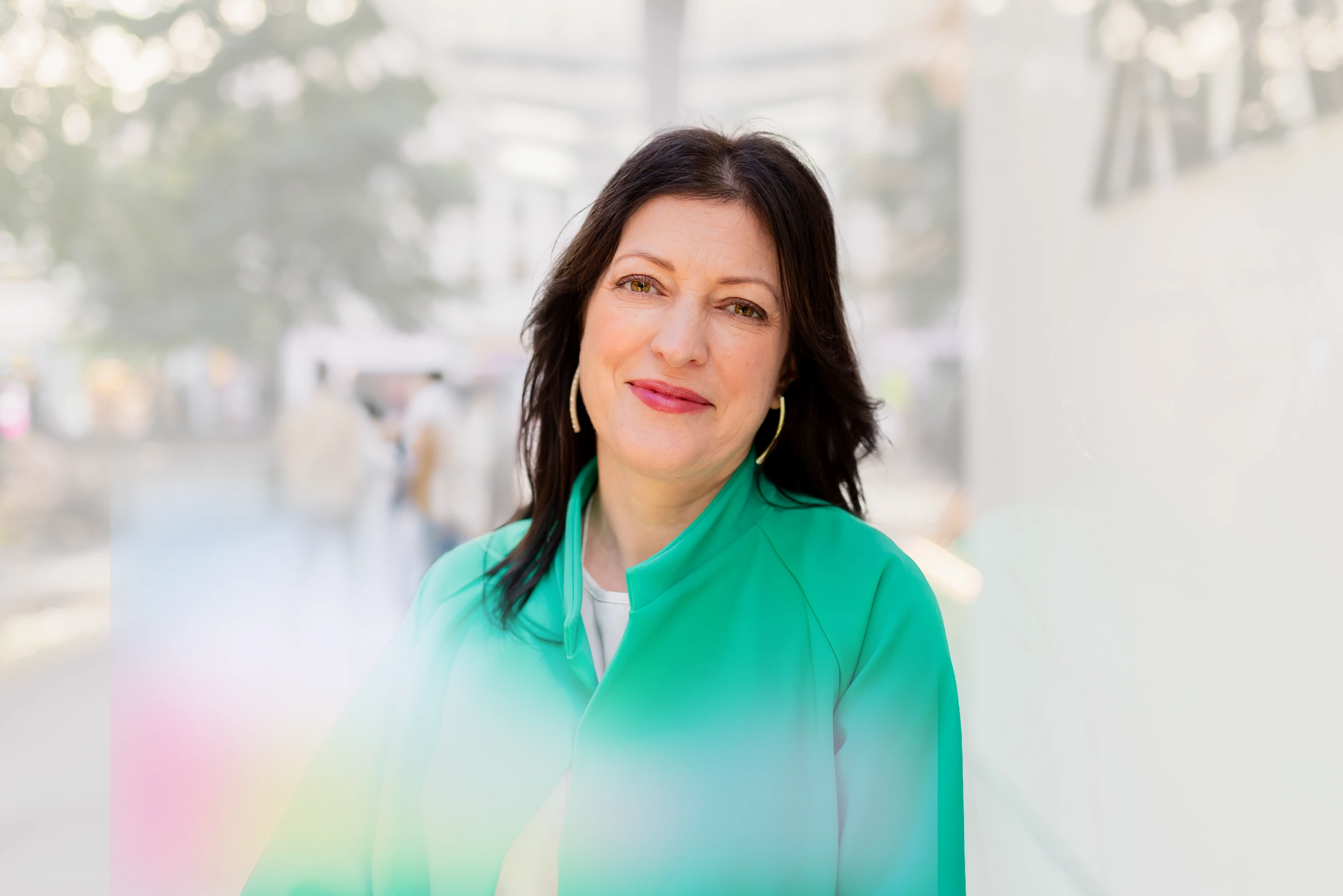
Gillian Caroe is a mediator, facilitator, and coach whose practice is built on a simple conviction: better conversations create better outcomes. She guides parties in dispute towards resolution, works creatively with senior teams on performance, and coaches talented professionals into high-impact leaders, with experience spanning organisations such as the NHS, EBRD, the University of Cambridge, and EY.
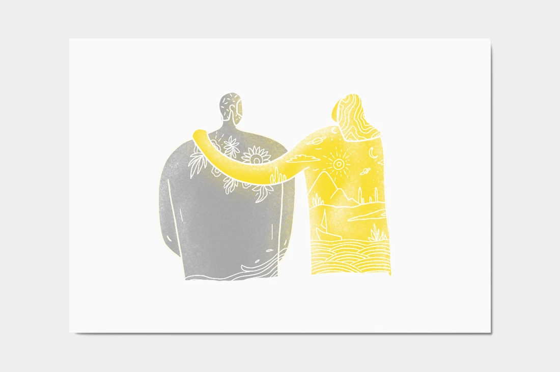
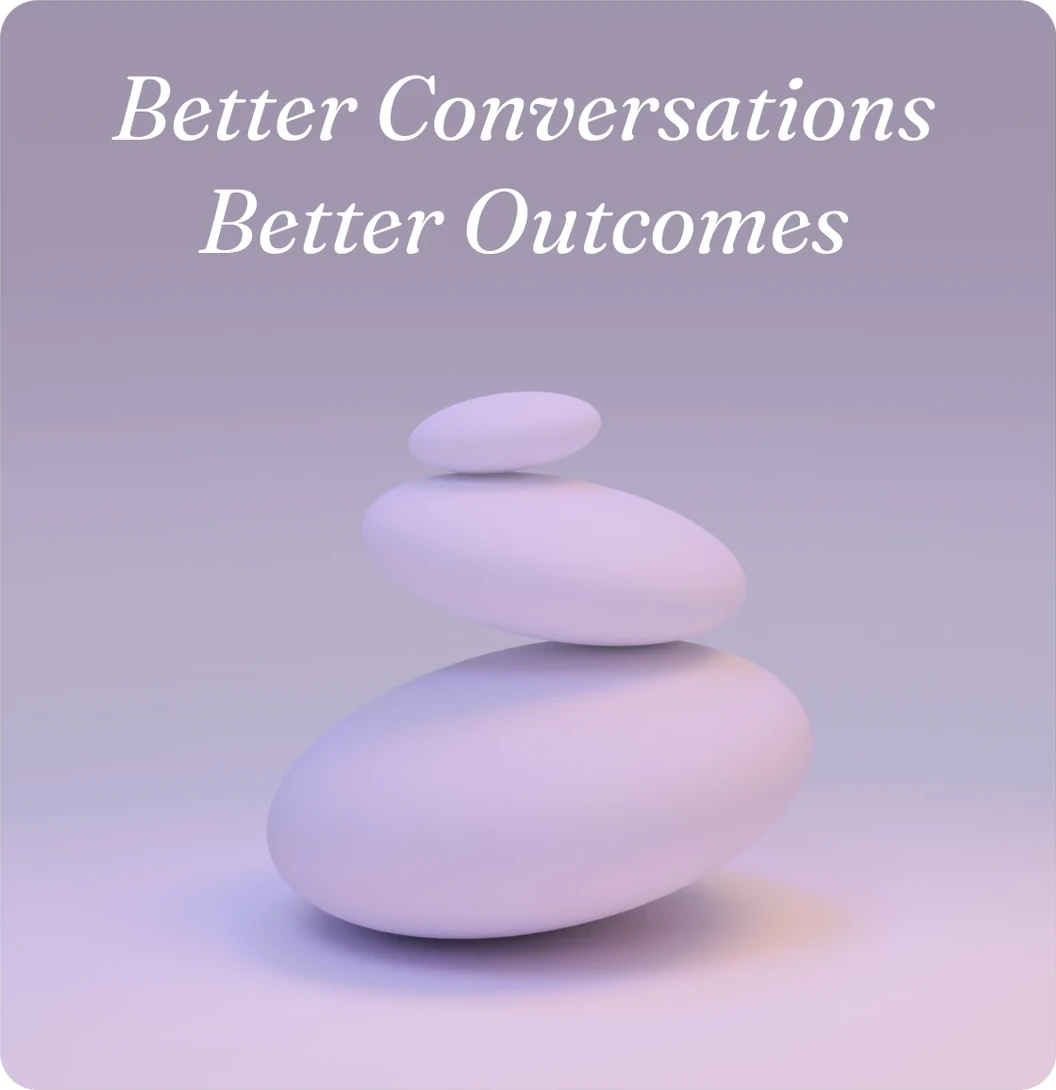
Balancing stones and soft gradient diagrams set the register before any of the work appears: ikigai, the body scan, the healthy-mind wheel, kindness returning. Thin line drawing over diffuse colour keeps ideas about difficult conversations feeling calm rather than clinical.

Fraunces Italic carries the voice, a warm display face for the lines that need to land. Nunito Sans takes everything practical. Both regular weight with no added tracking, so the pairing stays quiet enough for the material it holds.
Coaching talented professionals into courageous, high-impact leaders.
Episode artwork built from the brand’s own bokeh gradient, each cover carrying its title, run time and place in the run of eleven. The overlapping circles, alone we can do so little, together we can do so much, recur from her practice material into the series.
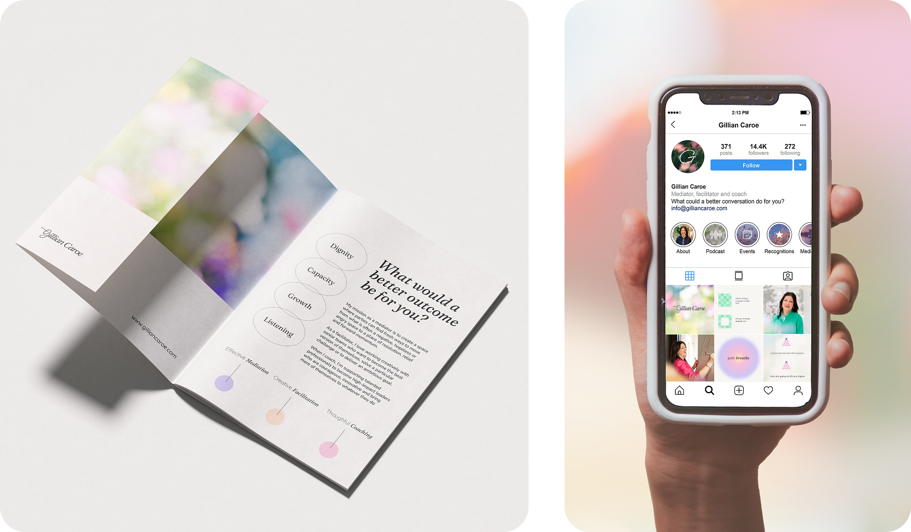
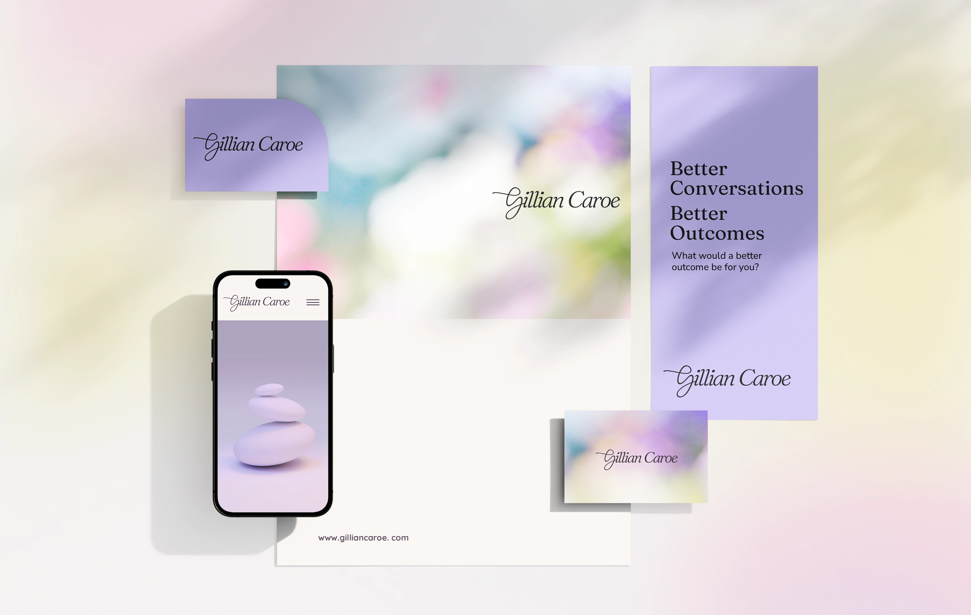
Cards, letterhead and a roll-up banner share one gradient and the signature logotype, so a first meeting, a printed handout and gilliancaroe.com all read as the same practice.
The materials she actually gives clients: reminders, the past, present and future reframe, gratitude prompts, the coaching progress lines. Set in the same type and gradients as the rest of the identity, so the tools belong to the practice rather than sitting beside it.